Visual Course Catalogue
A tool built for admins that became a tool for sales.
Project Overview
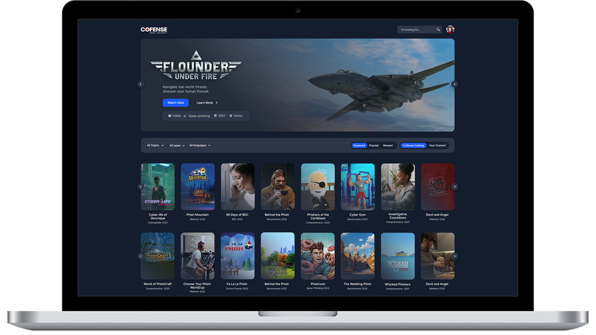
A redesigned course catalogue for an enterprise cybersecurity Learning Management System, built to help organisations browse, assign, and manage training more efficiently.
As the course library expanded, the existing experience made it difficult for admins to find relevant content quickly, and just as difficult for our sales team to showcase that library's depth and relevance during client demos. The goal was to create a more intuitive, scalable interface that improved discovery for day-to-day use, while doubling as a compelling asset for onboarding and sales conversations.
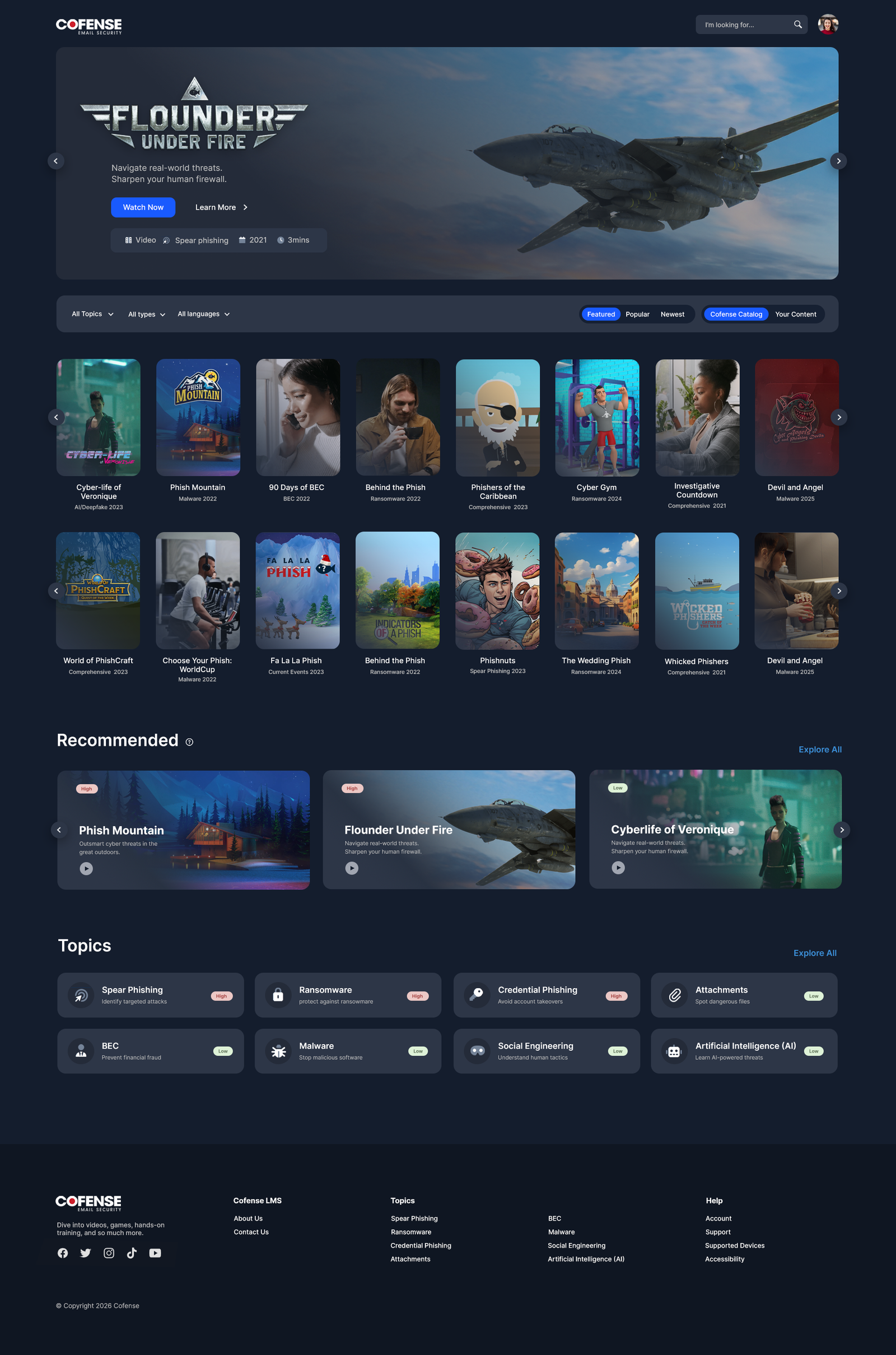
Inspired by familiar streaming interfaces, the catalogue introduces a more visual and structured way to explore content, organised by topic, skill level, and compliance requirement.
My Role
Outcome & Impact
Both internal teams and sales functions experienced measurable improvements after launch:
x2
Streamlined internal processes made day-to-day admin tasks significantly quicker.
45%
Admins found and managed courses 45% faster, thanks to improved search, clearer categorisation, and reduced duplication.
55%
Onboarding completion rates and upsell conversions increased by 55%, as sales teams could now clearly demonstrate course value and relevance live, in front of clients, instead of describing the library in the abstract.
What started as an admin-facing usability fix ended up doing double duty. The same visual structure that helped admins find courses faster gave sales reps a live, browsable showcase of the platform's depth, turning the catalogue into a highly effective sales enablement tool.
Research Phase
Competitive & UI Benchmarking
To inform the design of the visual course catalogue, we reviewed platforms that excel in either enterprise training, learning management, or intuitive content browsing. This included Coursera for Business, Pluralsight, Salesforce Trailhead, Udemy Business, and Netflix.
Pluralsight offered a stronger visual UI, using skill tags and category-based navigation. We borrowed their use of horizontal content groupings and labelled thumbnails to help admins explore at a glance. Udemy Business, while simpler in style, reinforced the value of a straightforward, scalable card layout and easy-access filters.
Netflix served as the visual and interaction benchmark. Its use of horizontal category rows, hover states, and thumbnail-based discovery became a core reference point. Beyond making the catalogue instantly navigable for first-time users, this familiarity mattered for a second reason: it meant sales reps could open the catalogue live on a call and it would immediately feel polished and premium, rather than like an internal admin tool being shown reluctantly.
Design Approach
01. Structure & Navigation
Content was organised into horizontal category rows, allowing users to scan and explore different areas without losing context.
02. Discovery & Filtering
Dynamic filters and improved search made it easier to narrow down content by topic, role, or requirement, reducing time spent locating relevant courses.
03. Visual Hierarchy
Course cards were designed with clear thumbnails and labels, making key information visible at a glance while maintaining a clean and consistent layout. Because the same interface was increasingly used in client-facing demos, this hierarchy was designed to read clearly on a shared screen, not just up close on an admin's desktop.
04. Interaction Design
Hover states reveal additional details without overwhelming the interface, supporting quick decision-making while keeping the experience lightweight, whether that decision is being made by an admin assigning training, or a prospect deciding what a subscription includes.
Final Designs
The final catalogue delivers a more intuitive and visually engaging way to explore a complex course library. By combining familiar interaction patterns with clear information design, it supports efficient daily use and more effective product demonstrations.
What began as an admin tool for managing training content became a dual-purpose asset, equally effective for day-to-day course management and for demonstrating platform value live in sales conversations. The result is a scalable system that improves usability for admins while strengthening the platform's value during sales and onboarding.